Designing for growth: Inside Parafin’s brand refresh
Emma Lundin
Growth is our business, but our own brand hadn’t been keeping up
At Parafin, growth is at the core of what we do. But by early 2025, our own brand identity wasn’t reflecting our momentum. Over the past few months, we've collaborated with a talented design agency to refresh our brand system. Today, we’re thrilled to share that evolution — designed to be cleaner, more accessible, and scalable. This refreshed identity represents not just who Parafin is today, but the ambitious future we’re building toward.
In this post, we'll share our process and key leanings from building the new system.
About Parafin and its design ecosystem
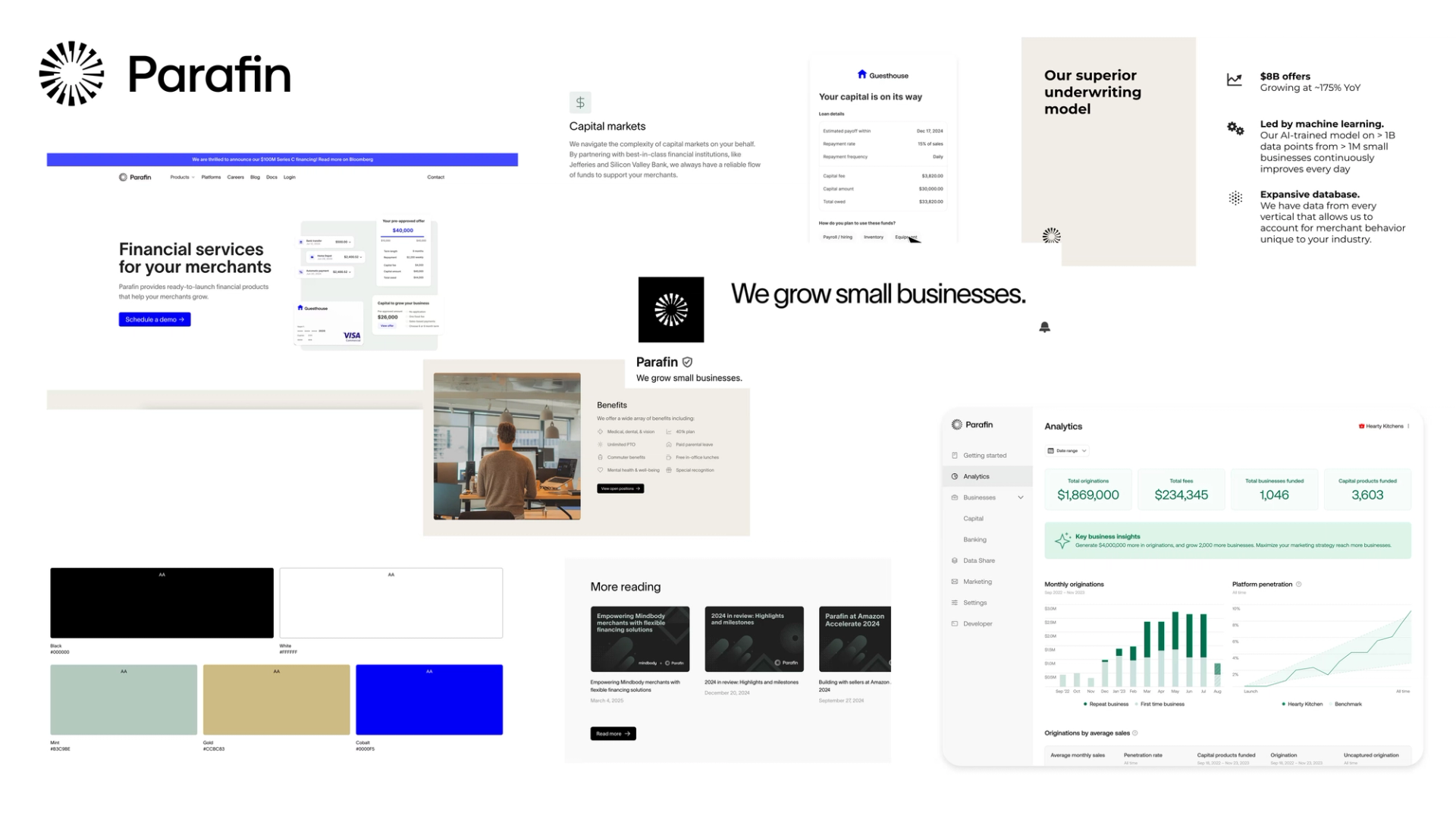
Parafin is an embedded finance company that helps platforms offer financial products to small businesses. We simplify complex tasks like underwriting, compliance, and customer support, making it easier for marketplaces and payment processors to provide financial services for their merchants.
We currently offer four different products and tools that are all essential to our business: Capital (Cash Advance, Flex loan, Term loan), Pay Over Time, Spend Card and Partner Dashboard. Most of our merchant-facing products are white-labeled, using each partner's primary color and logo. Partners customize their businesses’ experience through the Partner Dashboard.
The Design team maintains two distinct design systems. The Parafin Design System serves Parafin-branded interfaces such as the Partner Dashboard, sales materials, and the website. Meanwhile, the White-labeled Design System powers our web SDK and is intentionally designed to look different from the Parafin brand since it's meant to be customized by partners. Balancing these two systems means the team owns a broad design surface area: we must enable partners to create experiences that feel fully theirs while also ensuring Parafin’s own brand is cohesive, recognizable, and elevated. Historically, we’ve focused heavily on the white-labeled side to empower our partners. Now, we have the opportunity to invest in our own design language, giving Parafin’s brand the same level of craft and attention that we bring to our partner experiences.
Why we hit refresh
Our mission to grow small businesses has not changed, however the scale of our mission has. We now power financial products for some of the world's largest platforms. Over time, our website audience has shifted — we're increasingly seeing traditional SMBs visit to learn who we are. With that in mind, we needed an identity that reflected our business while feeling as approachable as the partners we serve.
Parafin’s original look was born in its scrappy start-up days. It was serviceable and easy to ship quickly. But as our product suite, partner list, and use cases grew, key limitations became clear:
- Inconsistent color palettes: We used different color schemes across our Partner Dashboard, website, and internal slide decks. This inconsistency resulted from previous brand iterations and maintaining two separate brand design systems — one for the website and another for the Partner Dashboard.
- Inconsistent font usage: We used four different fonts across our surfaces (Lausanne and Montagu Slab on the website, Montserrat in slide decks, and Inter in Partner Dashboard). This inconsistency arose because the website fonts weren't compatible with Google Slides and didn't work well in our Partner Dashboard interface.
- Brand confusion: Without clear guidelines, new assets drifted off-brand, making it harder to stand out in a crowded fintech landscape.
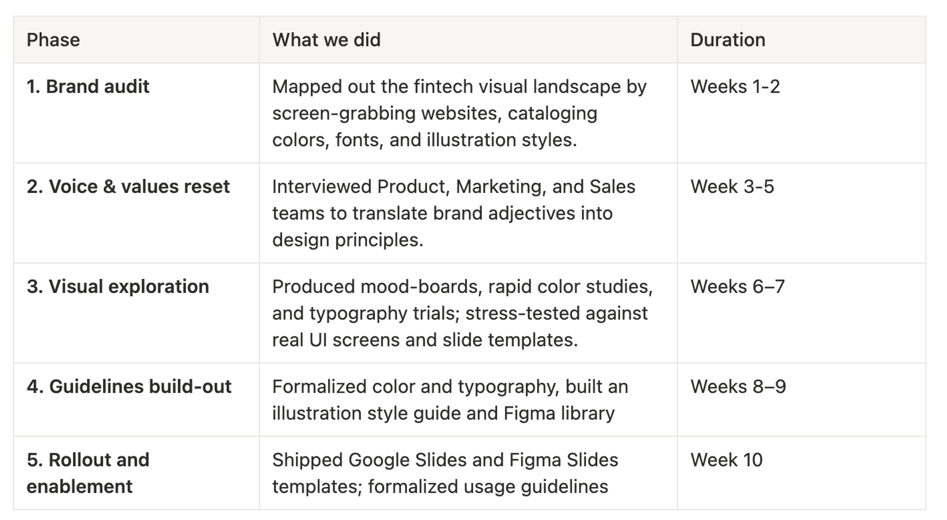
Our design process
Over ten focused weeks, we evolved Parafin’s brand from an initial concept into a fully operational brand system. The process was intentionally front-loaded with research and voice definition, then shifted into rapid visual exploration and structured rollout. Each phase built on the previous one — giving teams clear checkpoints to validate direction, stress-test ideas, and lock in guidelines before code ever ships.
Who we are, and how that shaped the design system
We extracted key attributes from our content style guide — professional, respectful, reliable, approachable, etc. These weren't just abstract concepts, they served as concrete design requirements that guided our visual decisions.
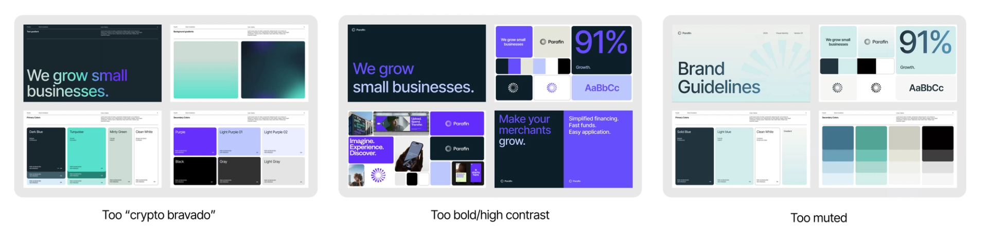
Finding the right color palette
We explored everything from high-energy neons often associated with tech and crypto aesthetics to understated neutrals that lacked depth and vitality. Finding a palette that stood out from other fintech platforms without alienating traditional SMBs was challenging. After iterating through 20+ shades, we landed on a hue that balanced energy, reliability, and professionalism.
What’s new
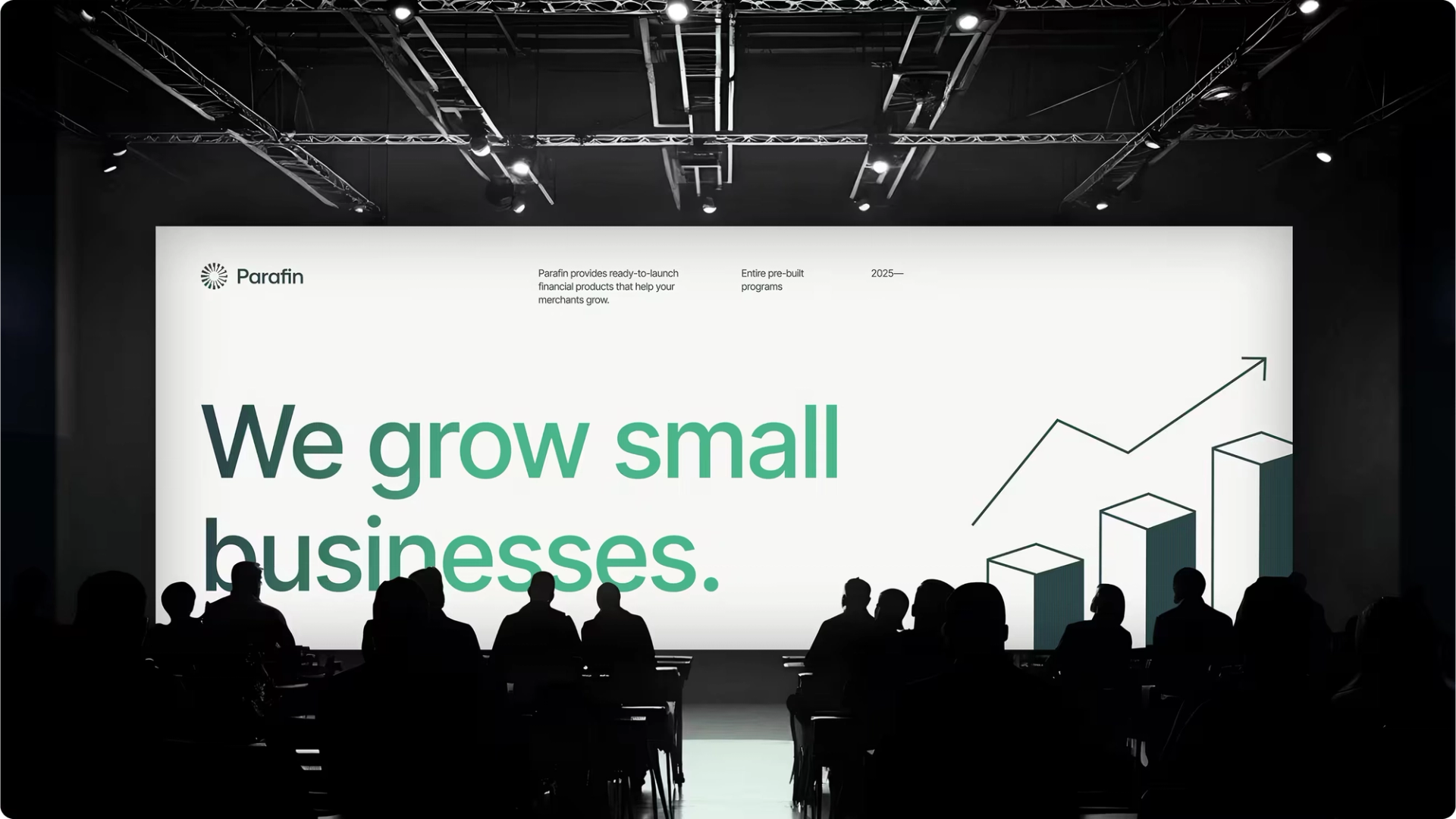
A bolder, more cohesive color palette
Green remains our primary color, symbolizing growth and trust, but now it’s supported by apalette that scales better with our products and channels. We also incorporated light and dark text gradients for headlines to create visual impact and reinforce our brand identity.
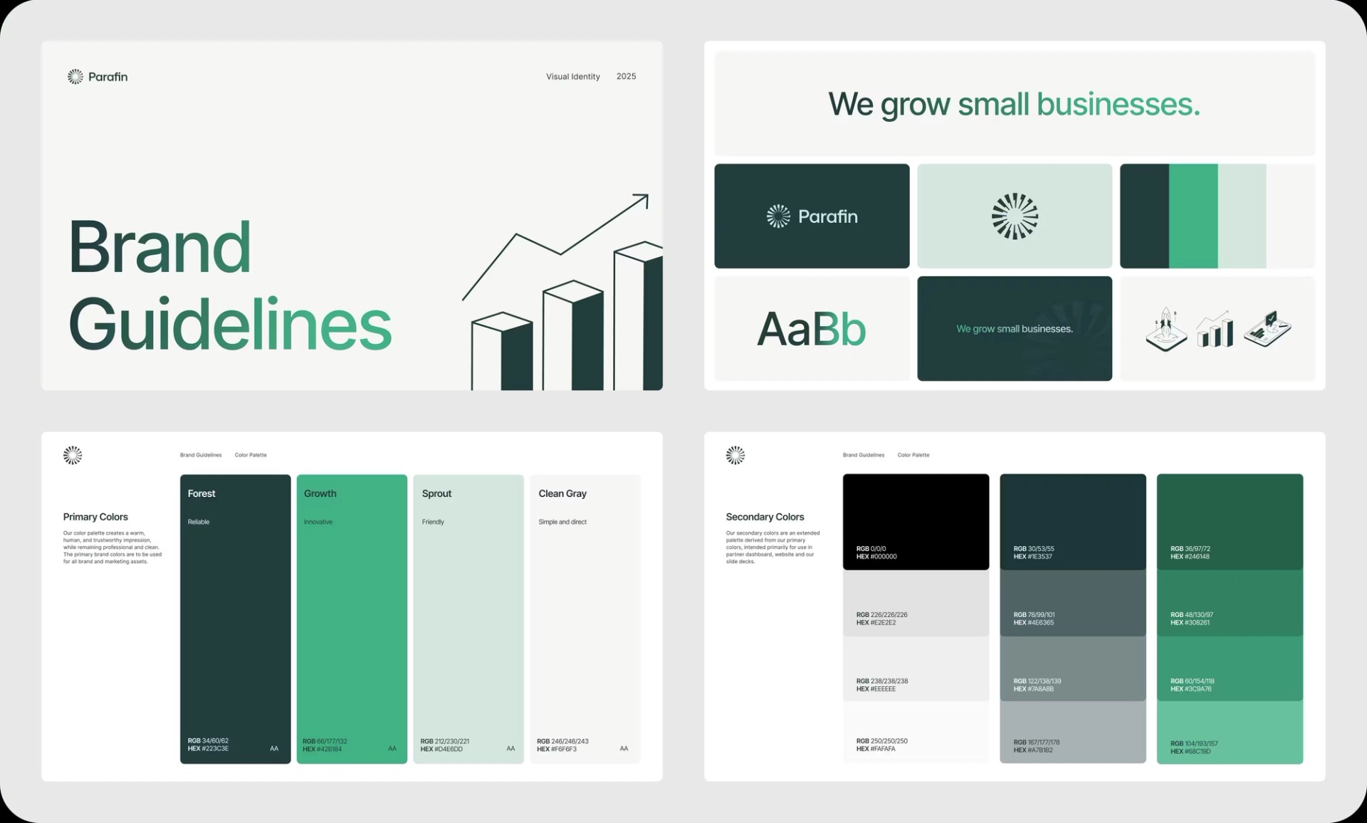
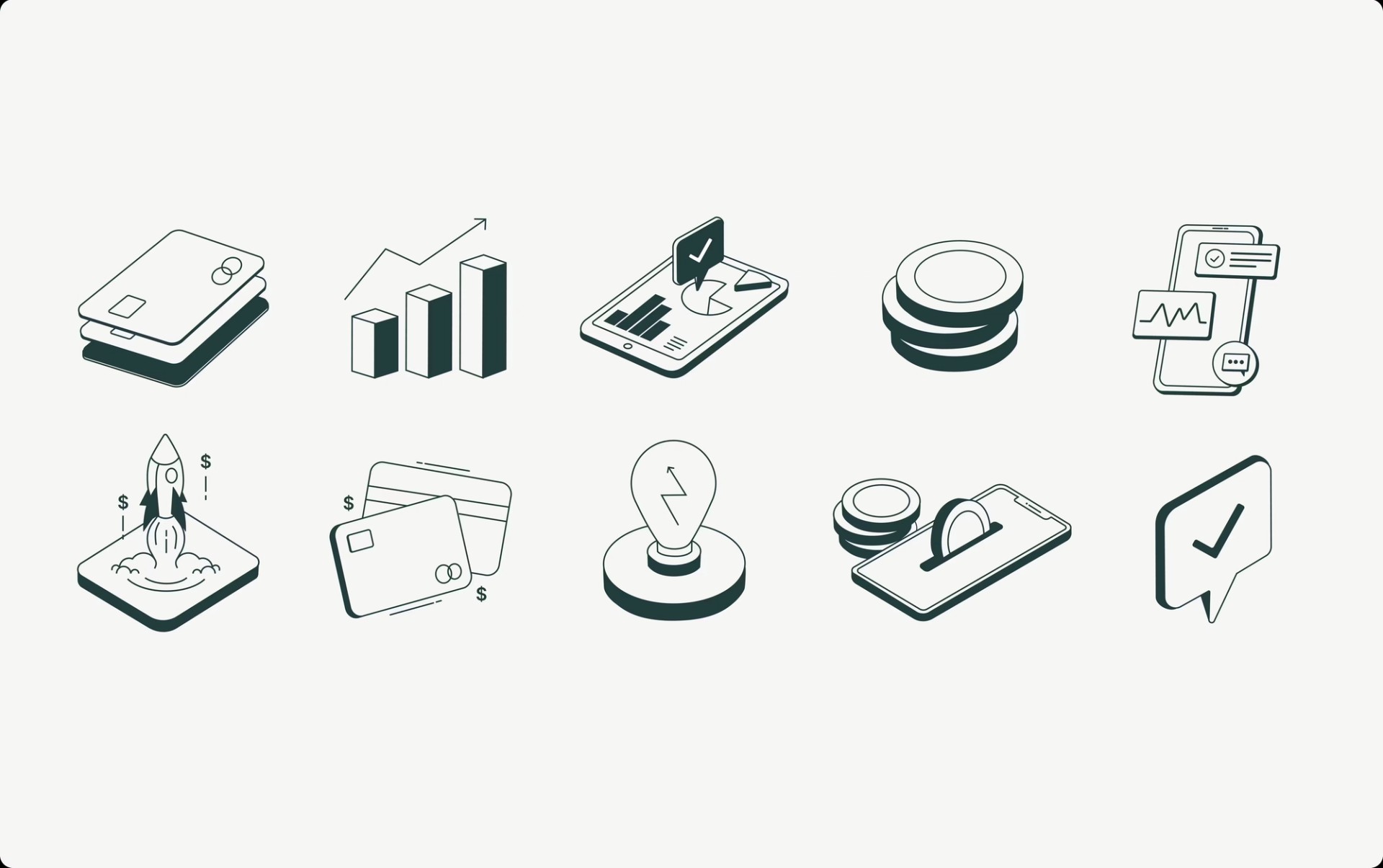
Illustration and iconography system
Our new illustration style achieves the perfect balance between professional fintech elements (graphs, credit cards, upward arrows) and approachable, soft, friendly strokes. We use illustrations as a key part of our visual identity to create a distinctive expression and strengthen brand recognition. The illustrations support our message of empowering small businesses to grow.
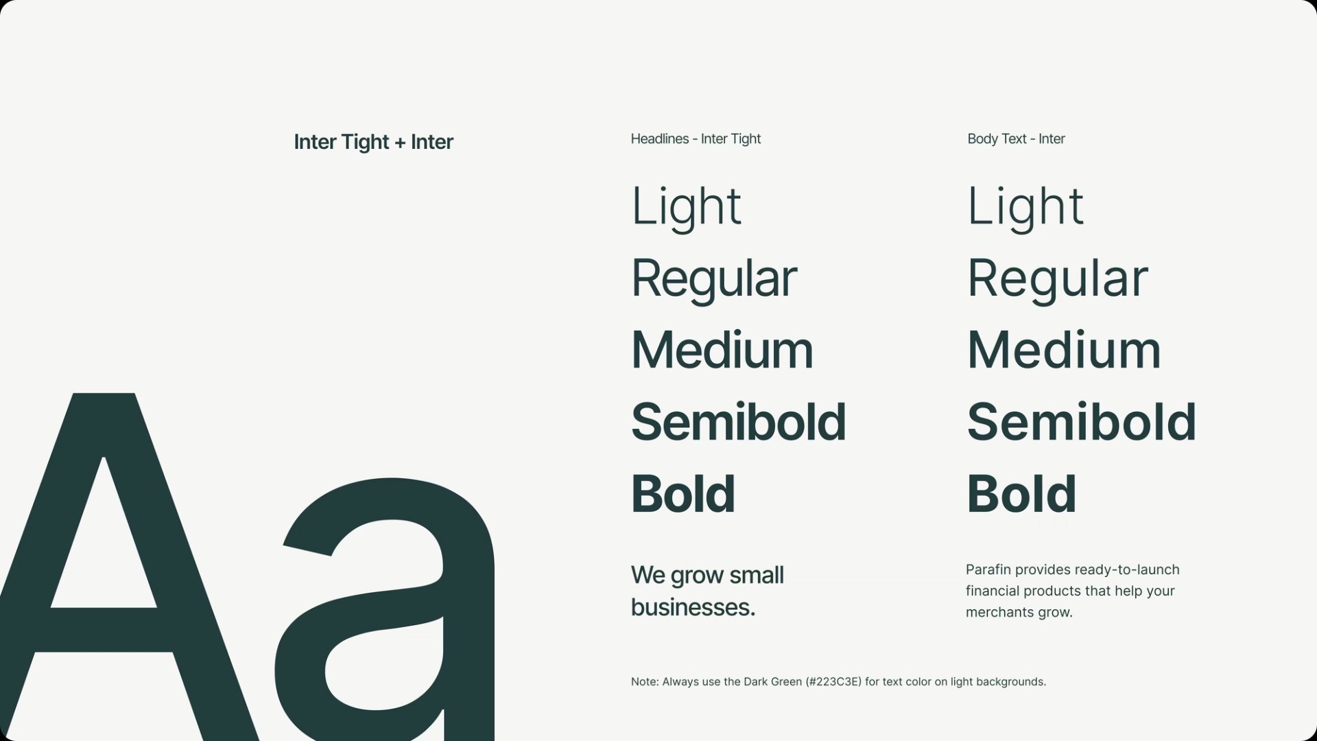
Consistent, legible typography
We standardized our typography. We’re using Inter for our user interfaces and we added Inter Tight for headlines on the website and slide decks. Both are open-source Google fonts, which means:
- Easy and instant adoption in Google Slides and web products.
- Visual unity everywhere from Partner Dashboard to conference swag.
We considered commissioning a custom typeface but opted for Inter and Inter Tight to stay on schedule. The trade-off: no bespoke letterforms, but immediate multi-platform consistency.
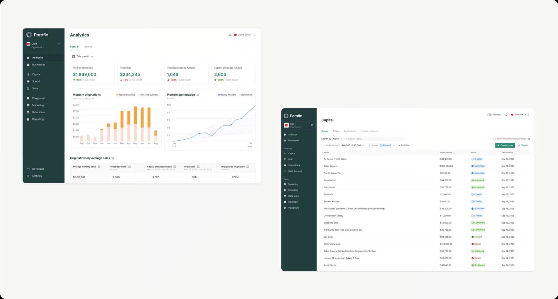
Partner Dashboard
Our Partner Dashboard has been refreshed with a modern look and feel, featuring an updated navigation that improves user workflow, redesigned status pills that communicate information more clearly, and enhanced graphs with improved data visualization capabilities. These visual improvements not only make the dashboard more aesthetically pleasing but also increase functionality and usability for our partners, allowing them to navigate and interpret data more efficiently.
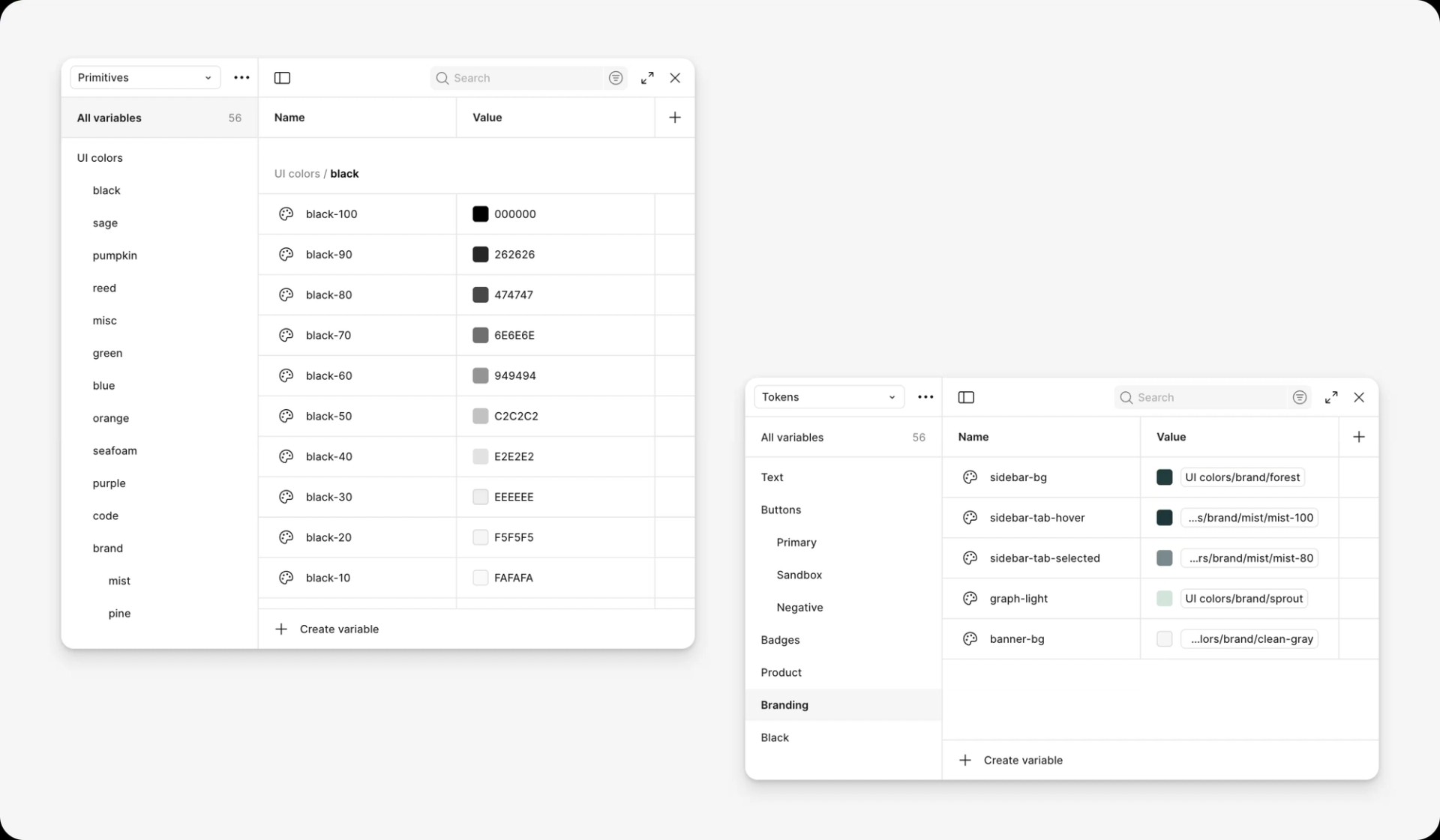
Tokenization
As part of this initiative, we also updated our Parafin design system variables in Figma. We implemented semantic naming for our design tokens to ensure consistent implementation across Figma, code, and marketing templates. This approach gives each color a purposeful name such as `sidebar-bg`, `text-black-primary`, and `gray-border`.
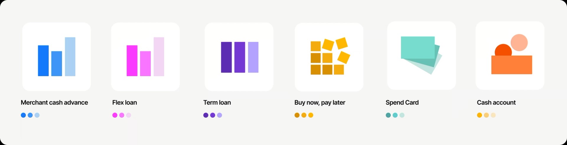
Product icons
We created a unique icon for each product to enhance the website and documentation experience. Each icon draws inspiration from what it represents — different bar shapes for repayment plans, cards for Spend Card, and so on. While grounded in these concepts, the icons remain intentionally abstract to feel modern, scalable, and adaptable across contexts.
Same mission, new look
A refreshed identity doesn’t change who we are, it clarifies it. We’re still dedicated to helping platforms empower small businesses with fast, flexible capital. Our new system simply tells that story with more coherence, warmth, and confidence.
Early impact
- Template adoption: All new slide decks now start from the approved Google Slides template library, and our go-to-market toolkit has been updated with the new brand guidelines.
- Positive partner feedback: Partners have already noted that the design system feels more polished. Within days of the launch, one platform PM told us: “Nice redesign! Looks so much cleaner.”
- Ongoing rollouts: We’ve redesigned our website, refreshed our social media assets using Figma Buzz, and updated the Partner Dashboard Figma component library.
Lessons we’re taking with us
- Double-down on discovery. A modest time investment in upfront research pays off by preventing expensive adjustments down the road.
- Lock the narrative, then design. When everyone agrees on the story we’re telling, visual and technical choices fall into place.
- Consider all touch points. When building a brand system, you must evaluate every surface area to ensure fonts and colors work effectively across all channels.
- Stress-test in the real world. Testing on real-life screens (conference room monitors, phones, various laptops) and product mockups reveals potential issues early.
Explore the new Parafin
- See it live: parafin.com
- Peek behind the curtain: Request a demo
- Join the conversation: Share feedback or tag us on X @ParafinHQ and @BuildParafin on LinkedIn.
Thanks to the team
This brand refresh was a true cross-functional sprint. Huge thanks to our contractor partner, the in-house Design and Marketing squads, and every engineer who swapped a hex code at midnight to make launch day happen. Your craftsmanship and commitment to small-business growth powered every pixel.
Interested in joining Parafin? We’re hiring. Check out our open roles.